StudyBlue
I joined StudyBlue right at the beginning of a complete site redesign. The goal was to update the UI from a dark color scheme to a light one, and create new UX to make the site easier to use. My role began as a UX Designer writing most of the CSS and expanded into a front end engineering role as I took on more responsibilities.
Visit Site →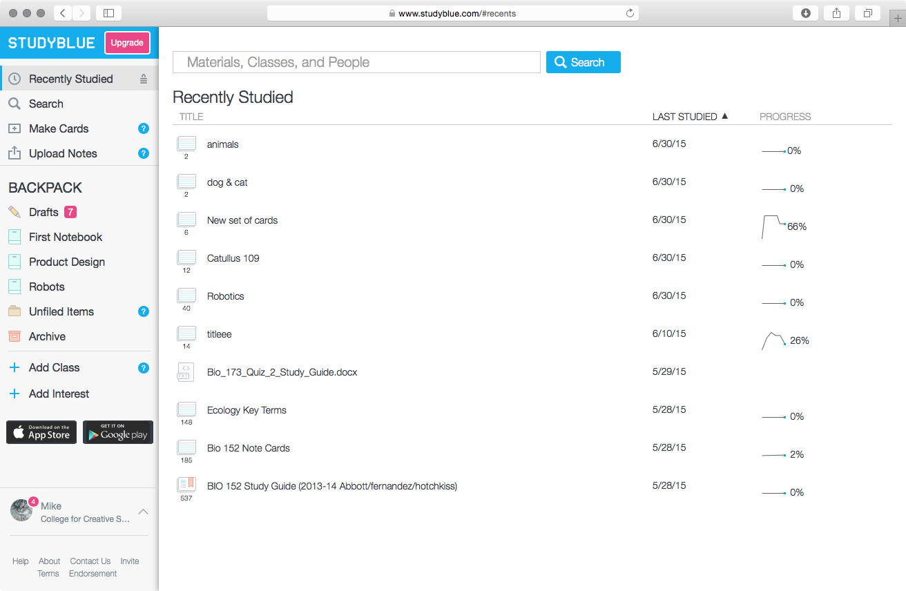
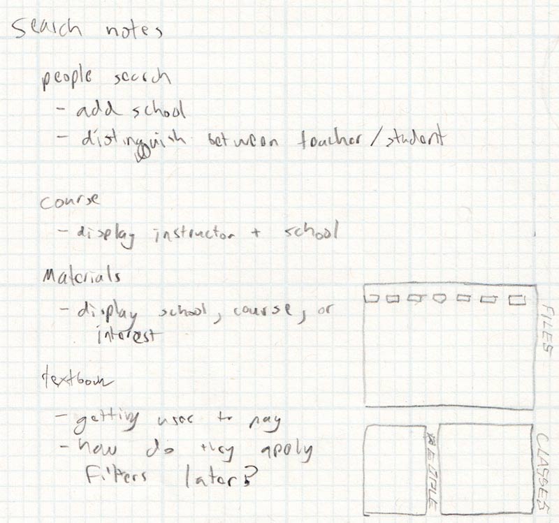
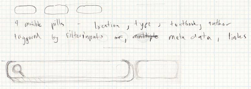
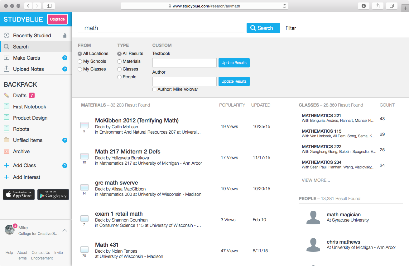
The search view was a particularly large beast to tackle. Originally, the search was separated into three pages, one for materials, classes, and people. For the new version, I wanted to condense everything to one page focused on classes with additional pages to view more results for classes and people.
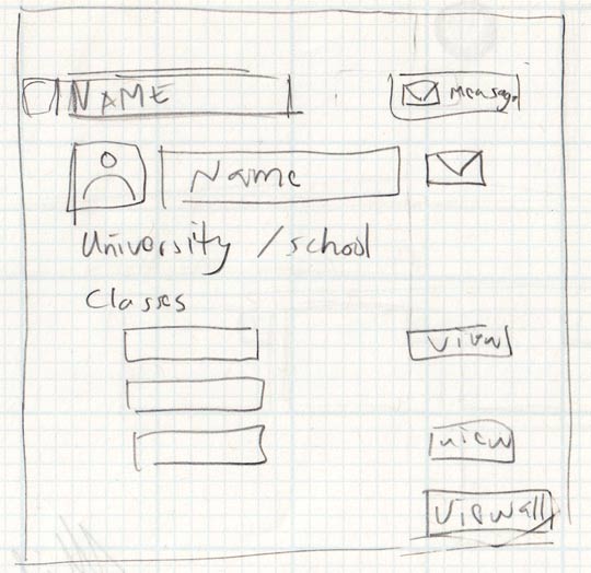
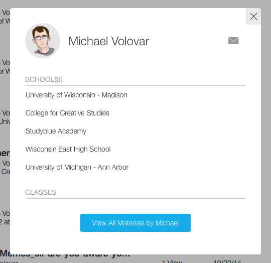
User information is displayed in a popup since it can be seen in multiple places and we didn't want to move away from the currently viewed page. Below are images of one of the initial sketches as well as the finished popup.